New cycle, new format, new identity
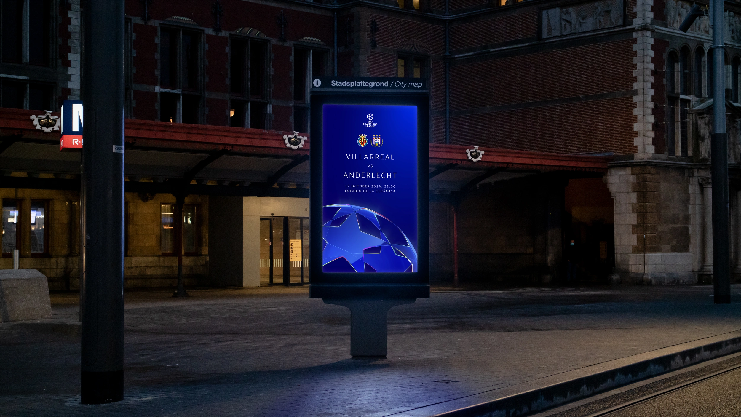
In a rapidly evolving sports landscape, staying iconic yet contemporary is essential. The new identity for 24/27, redefines and renews the core elements that have come to symbolize the UEFA Champions League. In close collaboration with UEFA, we created a cohesive and rejuvenated cycle identity that is deployed across all touchpoints, including in-stadium applications, broadcast, digital, print, licensing and cobranding.
The UEFA Champions League stands as the pinnacle of European football, delivering a unique, emotional and captivating experience for clubs, players and their fans alike. It is one of the most iconic brands in sport.
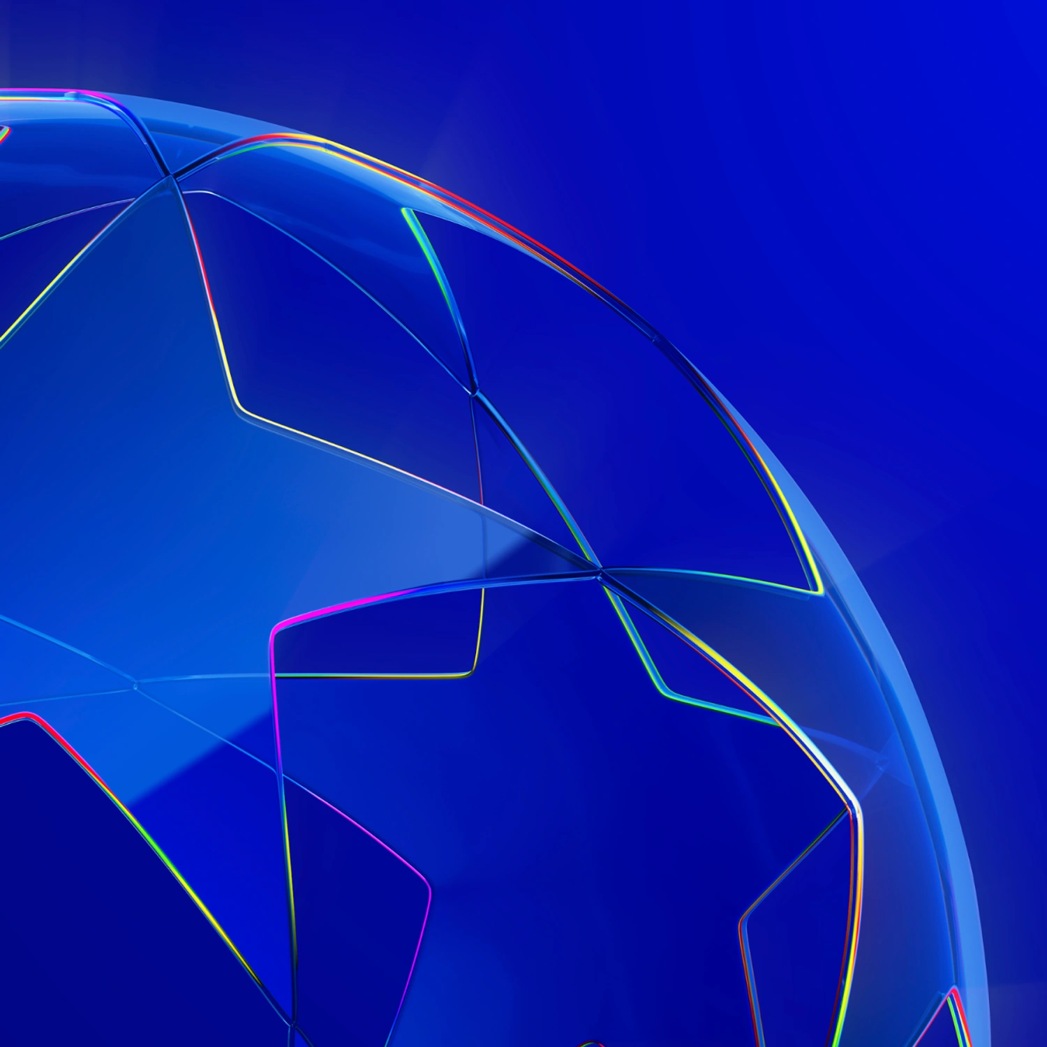
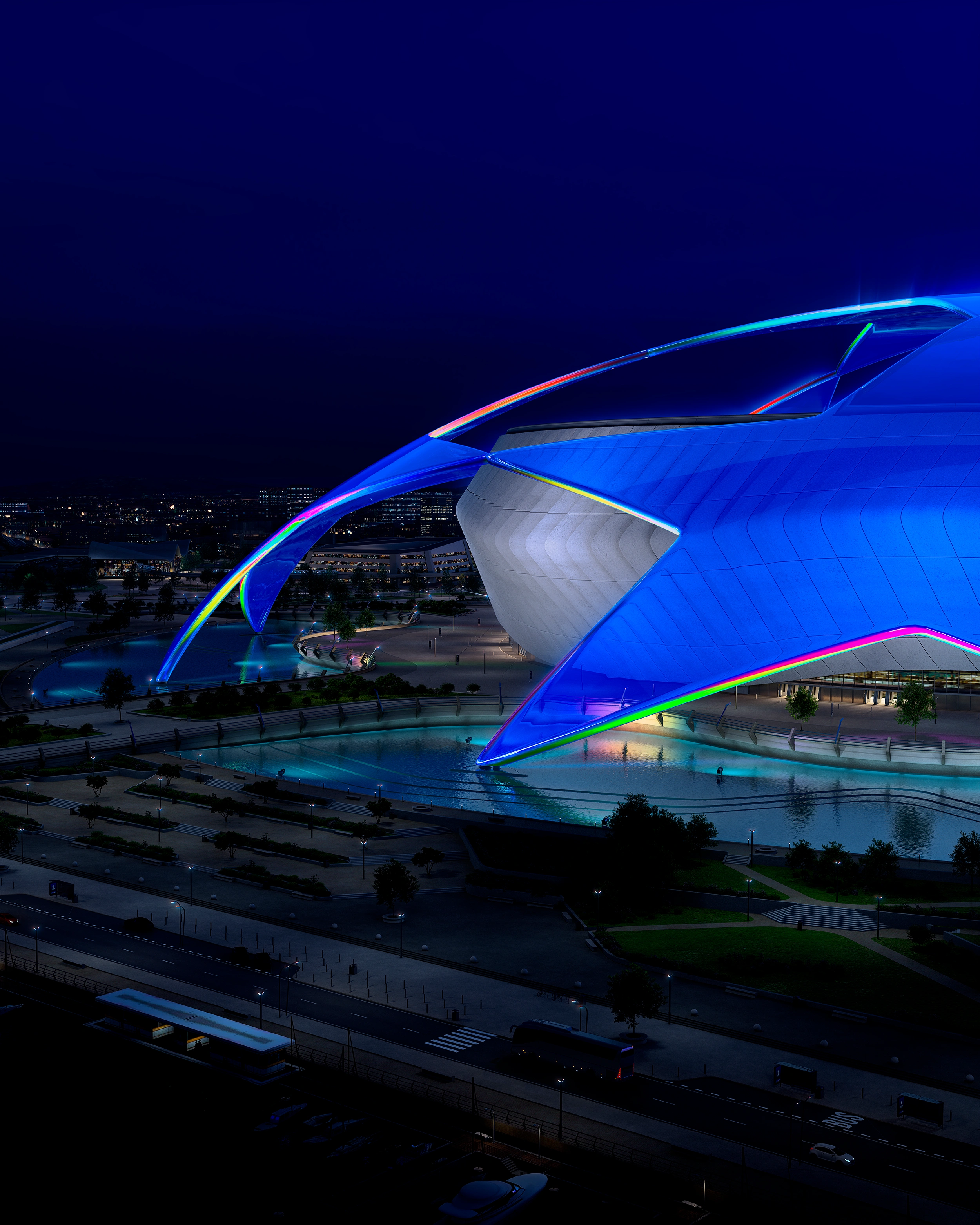
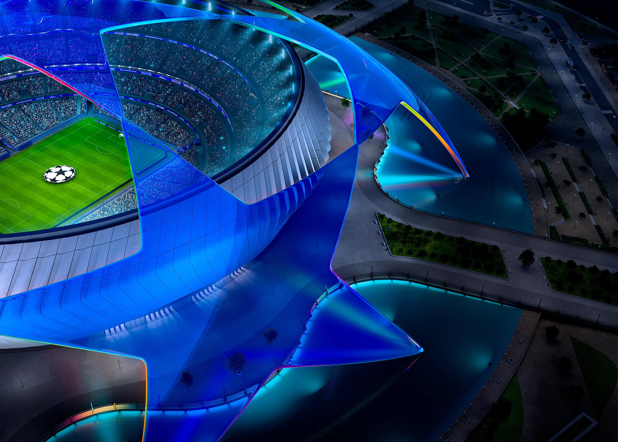
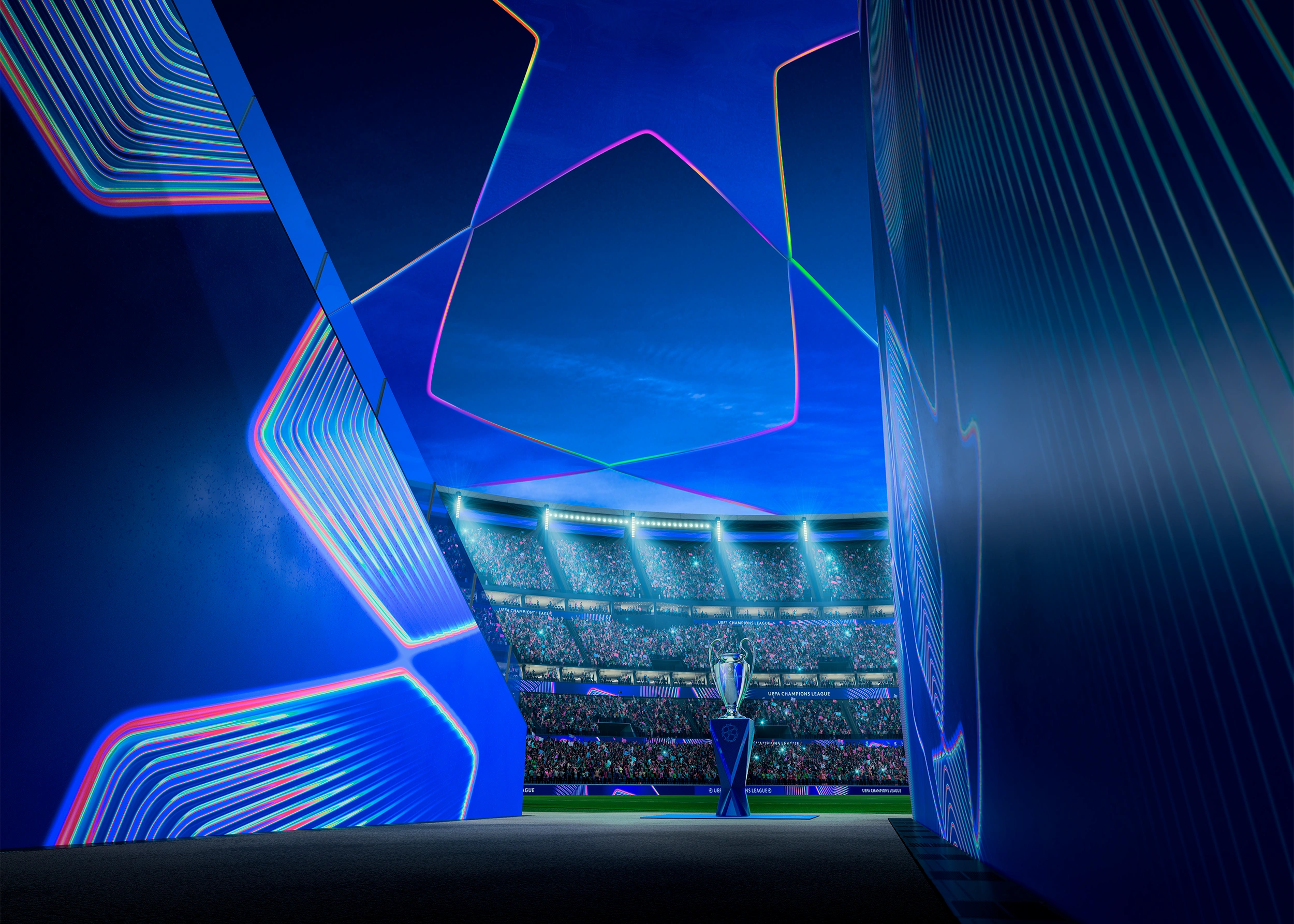
The new brand identity aims to rejuvenate the brand, while keeping it premium and sophisticated. The primary brand elements — the starball and the Ultimate Stage stadium with the starball roof which are the best known properties among fans — have been renewed with a cohesive and flexible look, ensuring they are still recognisable while also having the capacity to adapt to new expressions.
The new brand concept features the iconic starball that has been at the centre of the brand since it was first presented, carefully crafted from glass.
The starball looks beautiful, delicate and fragile, yet precise and crafted with passion and precision.
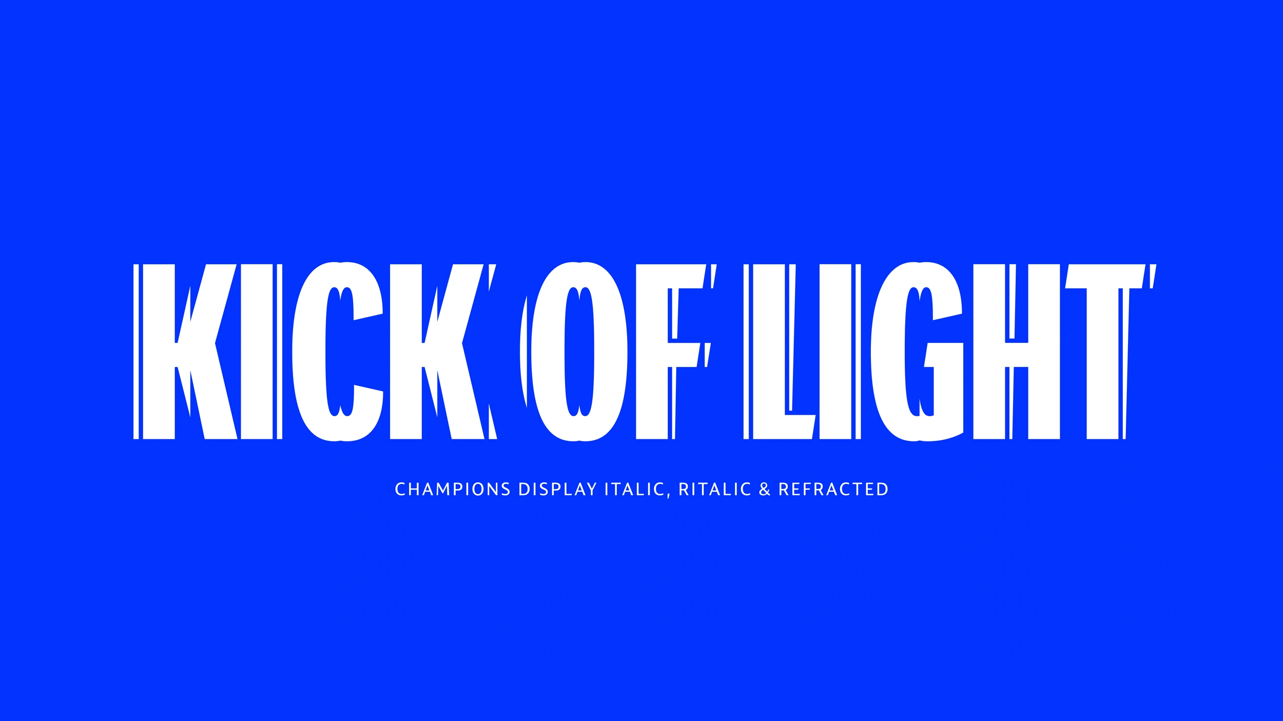
Kick of Light is based on the characteristics of a prism, which breaks white light shining through it into an endless array of colour, visible at the stars’ edges. These colors symbolize the clubs in the competition. The prism effect and the distortion seen through glass are central to the new brand.
These elements combined, result in a brand identity that’s more colourful, bolder and younger than ever before.

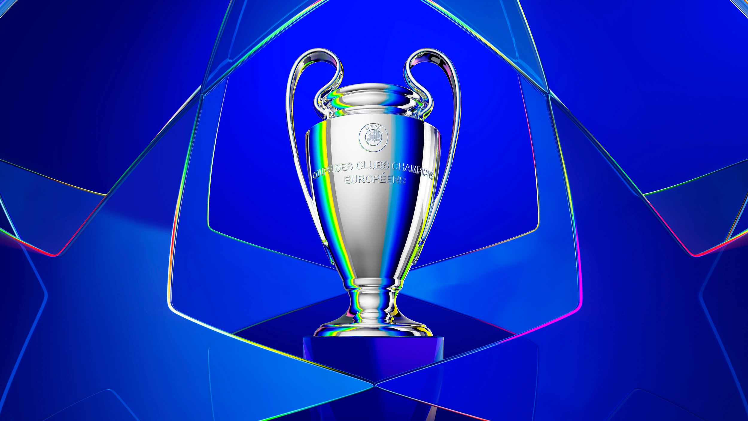
The new Ultimate Stage is an extension of the starball, bringing the glossy glass look and colour refractions into the architecture. Seamlessly integrated into a gorgeous cityscape, the stadium is an invitation for a prestigious and unique experience of a European match night.
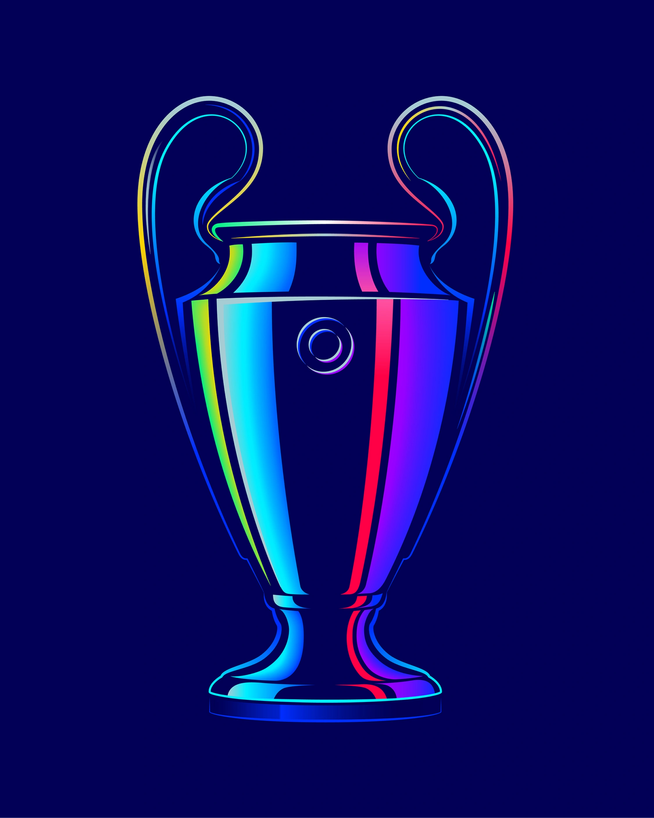
The concept extends into vector formats, with new 2D graphics, along with new patterns and vector assets for licensing products appealing to all ages.
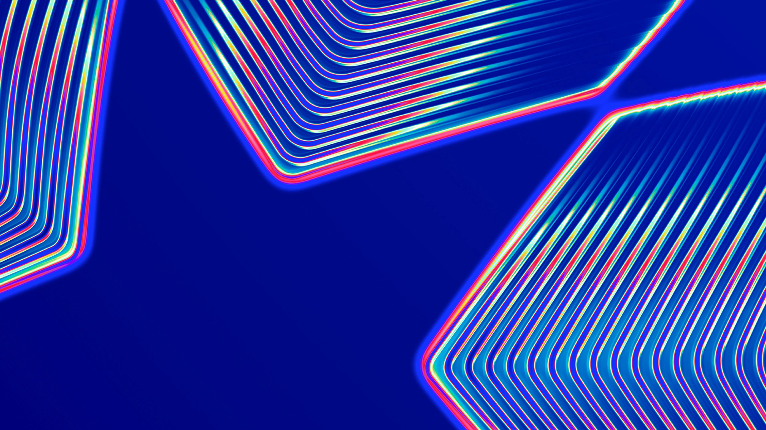
In line with the concept of distortion and colours as a result of the prism effect, a new asset is introduced: the light wave texture. Waves of light that radiate from the shapes of the starball, colourful, expressive and bold.
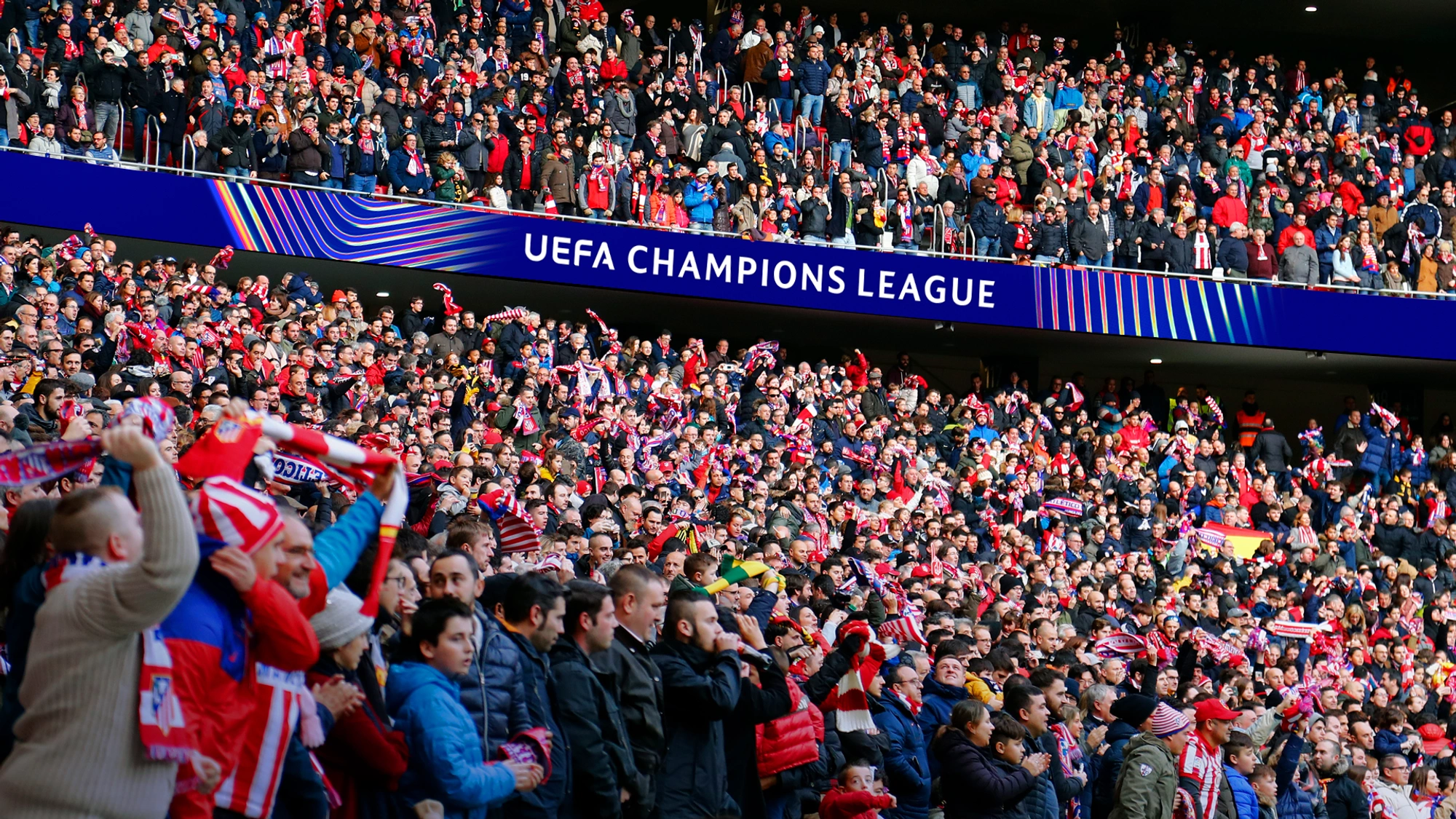
The light wave appears in various applications, such as the tier-dressing. This will have a clear and noticeable impact on the in-stadium experience for fans. And the light wave will also be the red thread in broadcast and digital experiences. Being visible in the title sequences, the TV graphics package and in social media applications.
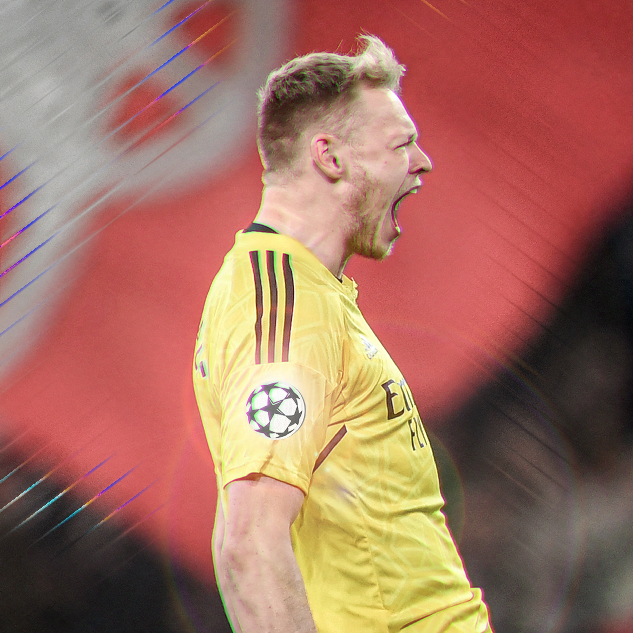
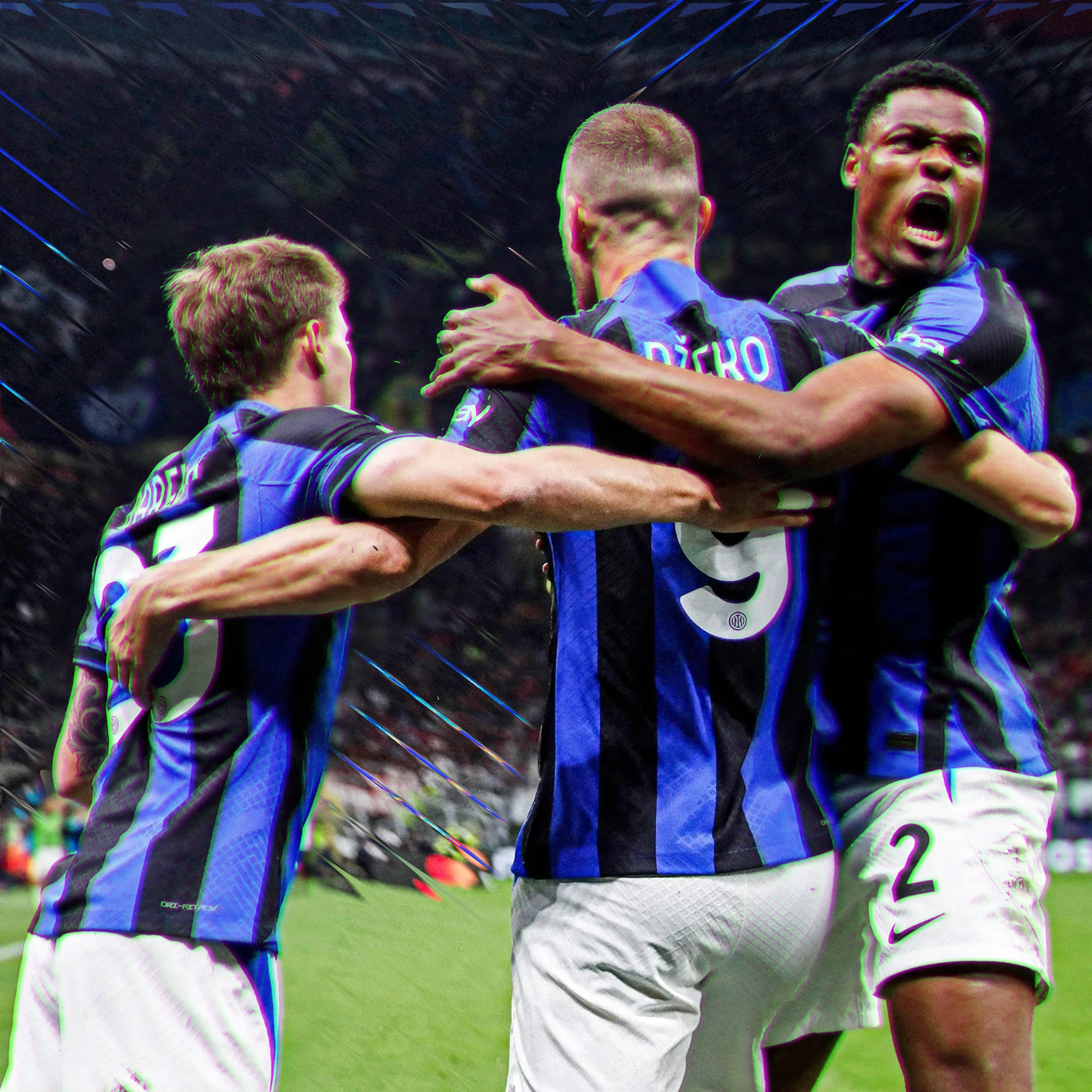
The design of the TV graphics features live match visuals with a modern and premium aesthetic, enhancing the viewing experience with sleek, sophisticated elements. All graphics have been updated, such as the replay wipe, lower thirds, full-frame graphics and the permanent clock.
Promotional pieces are seamlessly integrated, while transitions and loops for studio sets are crafted to maintain visual consistency.
Unique and elegant animations tie everything together, creating a cohesive and engaging visual experience that stands out in its elegance and innovation, all while meeting the functional requirements of a match broadcast.
A new expressive font
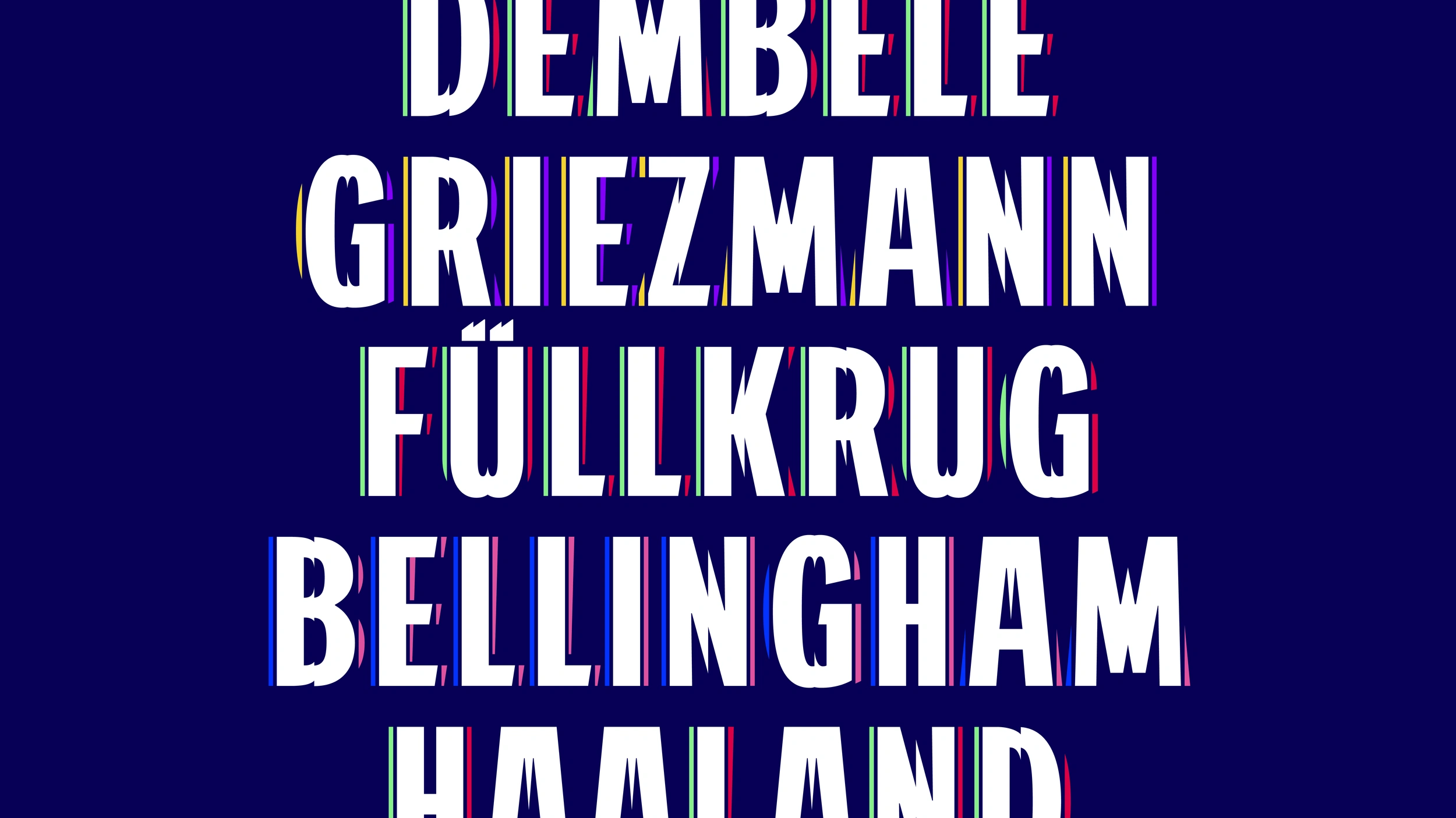
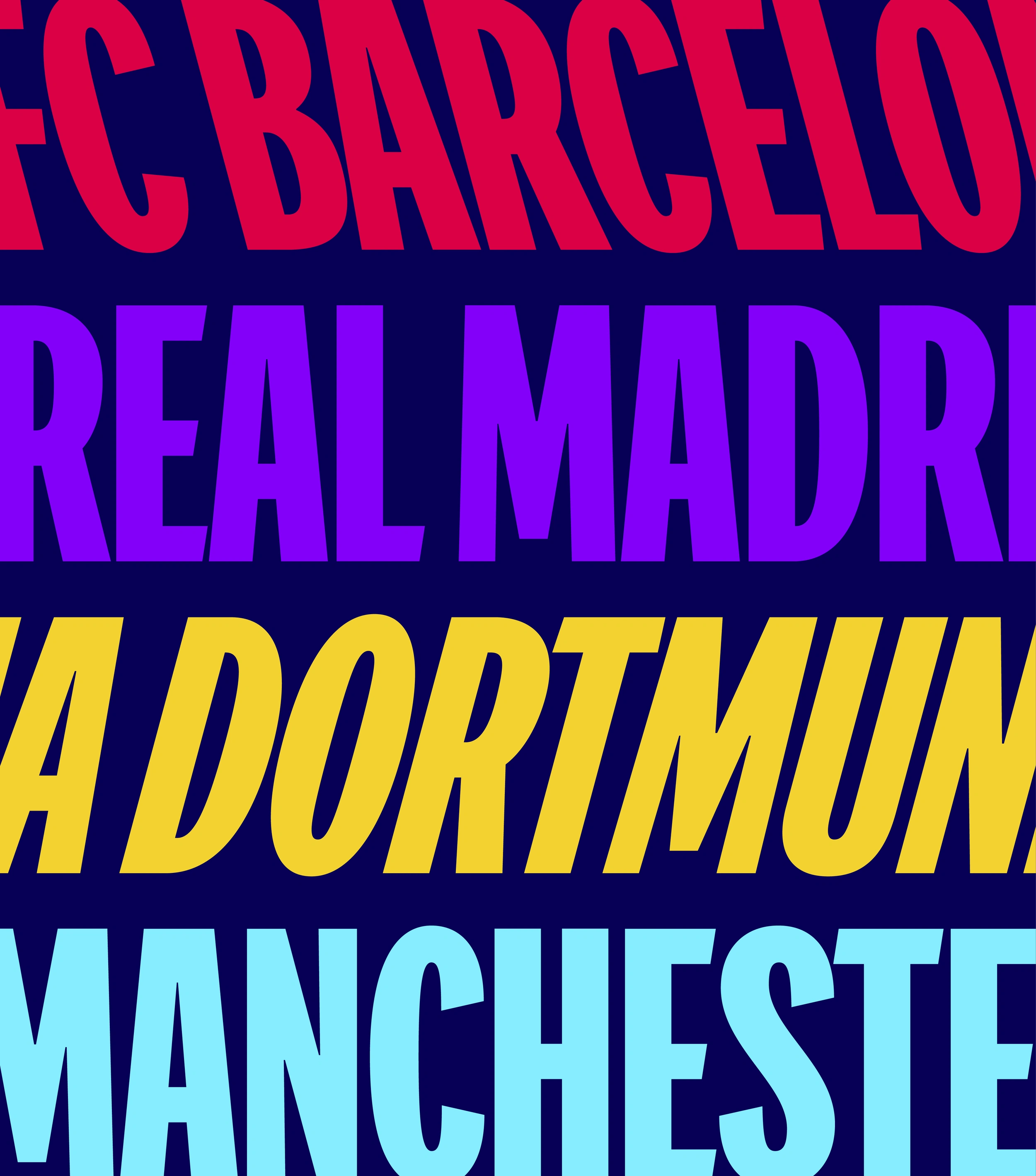
The concept of colour and refraction has also been applied to the bespoke competition typefaces. A special version has been added to the Champions typeface, Champions Display Refracted which is inspired by the refraction concept and which can partially take on different colours per character.
Additionally, the Champions Display family has been completed with the Italic and Ritalic styles for a more dynamic use of the font.

This brand evolution signifies a bold step towards the future, showcasing the UEFA Champions League’s potential with this new cycle, making the upcoming years of football more exciting and engaging than ever before.
Vasava
Found
Coffee & TV
La Cápsula
Higgins Postproduction