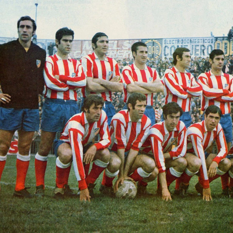
Under the motto "Looking to the future, embracing history," Atlético de Madrid embarked on an ambitious rebranding project. Listening to their fans, the club decided to bring back the iconic crest used from 1947 to 2017.
This project not only revitalizes the club's visual identity but also redefines its brand architecture, positioning Atlético de Madrid as the platform for all its sporting activities, while "ATLETI" becomes the social aggregator of projects.
Recovering a historic symbol
Atlético de Madrid faced a significant challenge: how to balance its rich history with the need for a modern, visionary identity. Listening to the clamour of its fans, the club made the decision to reinstate its most beloved crest, the one used between 1970 and 2017, a symbol that connects the glorious past with a promising future.

Two brands, one soul.
The branding strategy, developed in collaboration with Comuniza, focuses on a comprehensive evolution that aims to transcend beyond football and historical rivalries with other clubs. The main approach is to go beyond nostalgic narratives to communicate from a radical present, highlighting authenticity, passion, and intensity both in the game and in everyday life.
The complex brand architecture needed simplification and clarity. The new brand architecture of Atlético de Madrid is optimized to organize and clarify the multiple brands and sub-brands that have emerged around the club, facilitating its management and expansion.
This architecture is structured at different levels: brand expressions, areas of action, and brand extensions. "Atlético de Madrid" is presented as the sports ensign, and "Atleti" as the emotional ensign. At another level are the various areas of the club's action, such as teams, facilities, and experiences, clarified internally without needing an external visual expression. Another category includes specific sub-brands like the men's, women's, legends, and eSports teams, facilities, and narratives centralized in Atleti Studios. Finally, there are extensions, including the academy and foundation, and various experiential spaces that enrich the Atleti brand.
This structure allows for coherence and flexibility, reinforcing Atlético de Madrid's identity and facilitating its growth and adaptation to new opportunities.
Manzanares:
The Voice of Atleti
The new "Manzanares" typography, created by Vasava, becomes the core of Atlético de Madrid's identity. Inspired by the morphology of the recovered crest and its aggressive, triangular shapes, this typography represents the club's history while projecting its combative and modern spirit. "Manzanares" becomes the main vehicle for written communication. The previous "Metropolitana" typeface is retained as a complementary font, but its use is limited to specific occasions such as historical or nostalgic communications or certain products that can benefit from its contribution.
Innovation and tradition in perfect harmony
Developed with Comuniza for the branding strategy and Combustion Studio for audio-branding composition, the project extends beyond a simple visual renewal. A sound identity was created to encapsulate the spirit and values of the club. From the audiologo to various tunes, each sound element was designed to resonate with Atlético de Madrid's passion and energy.
The new visual and sound language has been implemented across all fan touchpoints, from system design and audiovisual content to motion design and merchandising guidelines. This integration ensures that Atlético de Madrid's identity is consistent and recognizable in every interaction, whether at the stadium, on social media, or in the club store.
The recovery of the historic crest and the renewal of the identity have deeply resonated with fans, strengthening their emotional connection with the club.
The duality of Atlético de Madrid and ATLETI has enabled more focused and effective communication strategies.
The unified visual and sound identity has created an immersive brand experience, elevating the club's presence both on and off the field.
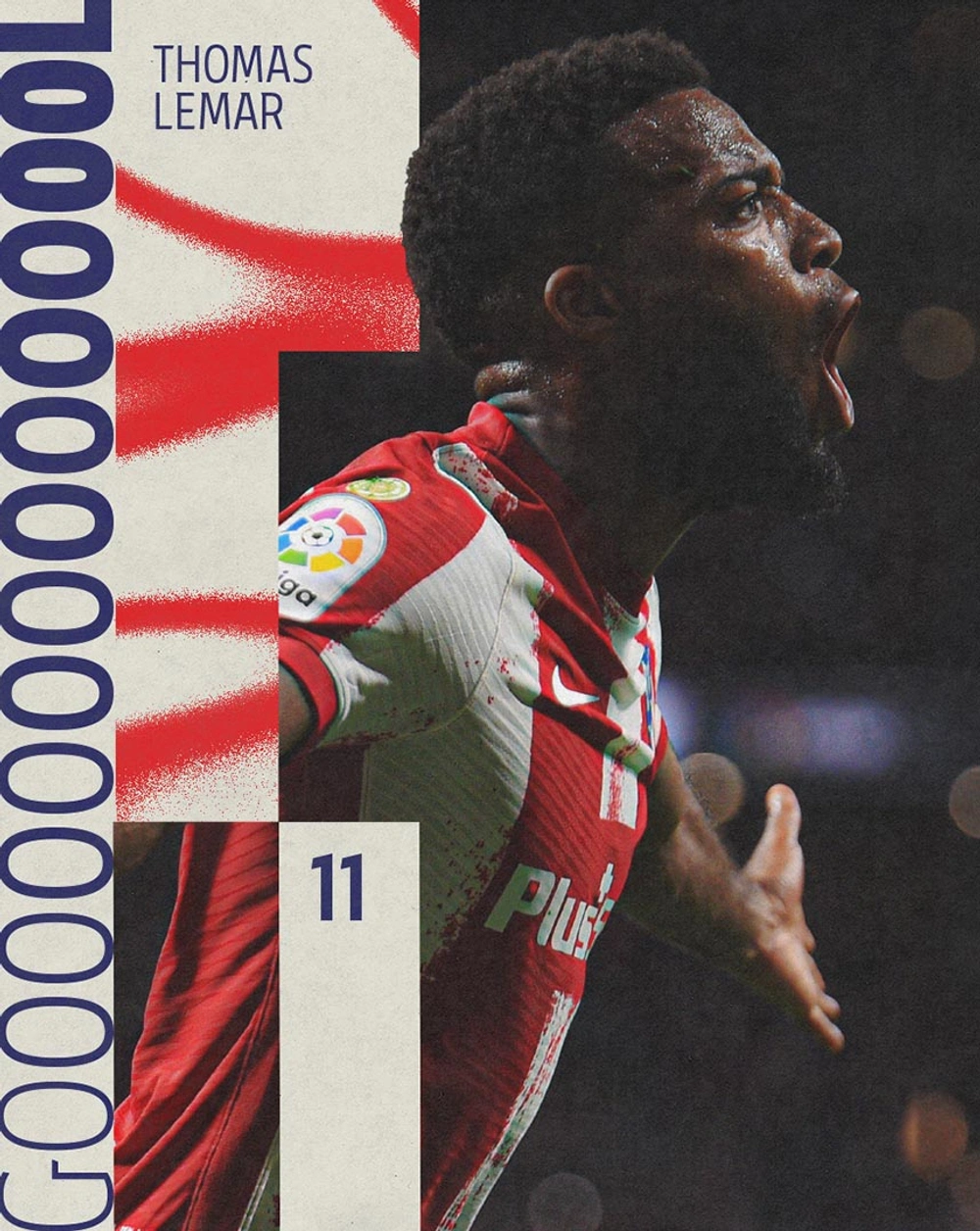
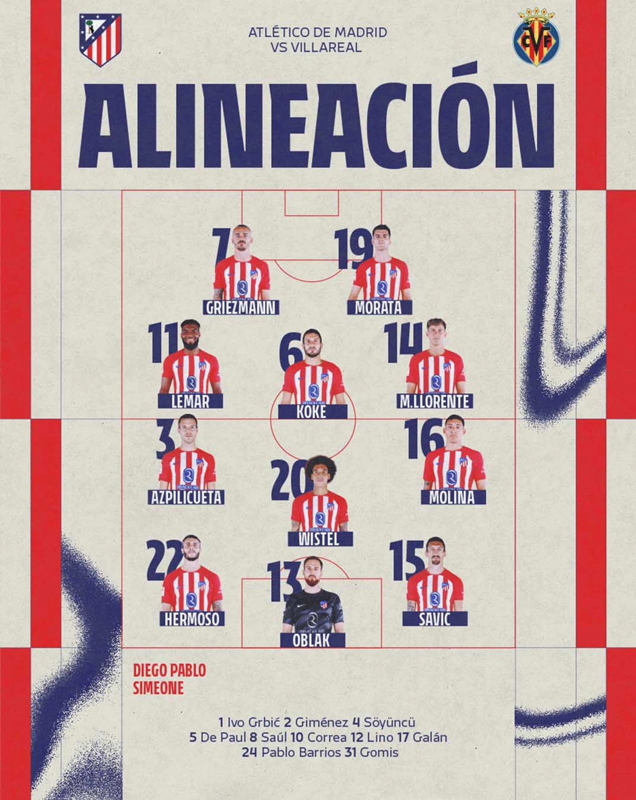
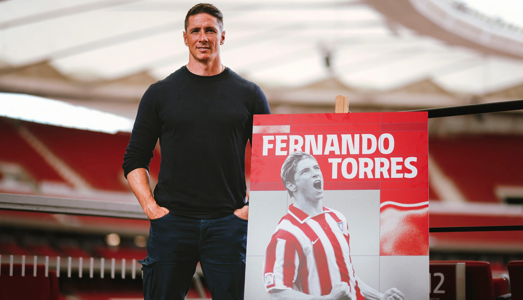
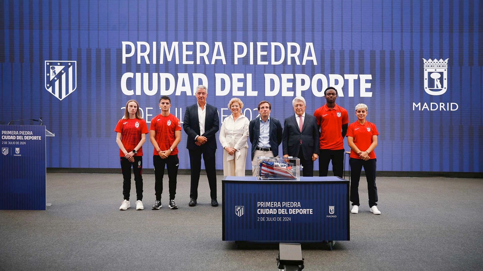
The design concept for Atlético de Madrid's layouts is applied to all communications. It is built on a regular grid that remains constant but adapts to the dimensions of the medium. This elastic grid helps position the dynamic stripes, which are visual elements in both position and pattern, creating a visual rhythm complemented by heatmaps. Combining all these elements results in an adaptable, rhythmic, synergistic, and dynamic arrangement.
A system to be shared
The flexibility of this new visual language ensures continuous interaction, elevating the engagement and loyalty of the fans.
This rebranding for Atlético de Madrid has successfully balanced tradition and modernity by restoring its historic crest and redefining its visual and sonic identity. In doing so, it has strengthened the emotional connection with its fans and solidified the club’s presence, preparing it for a future full of opportunities.
Comuniza
Combustion Studio