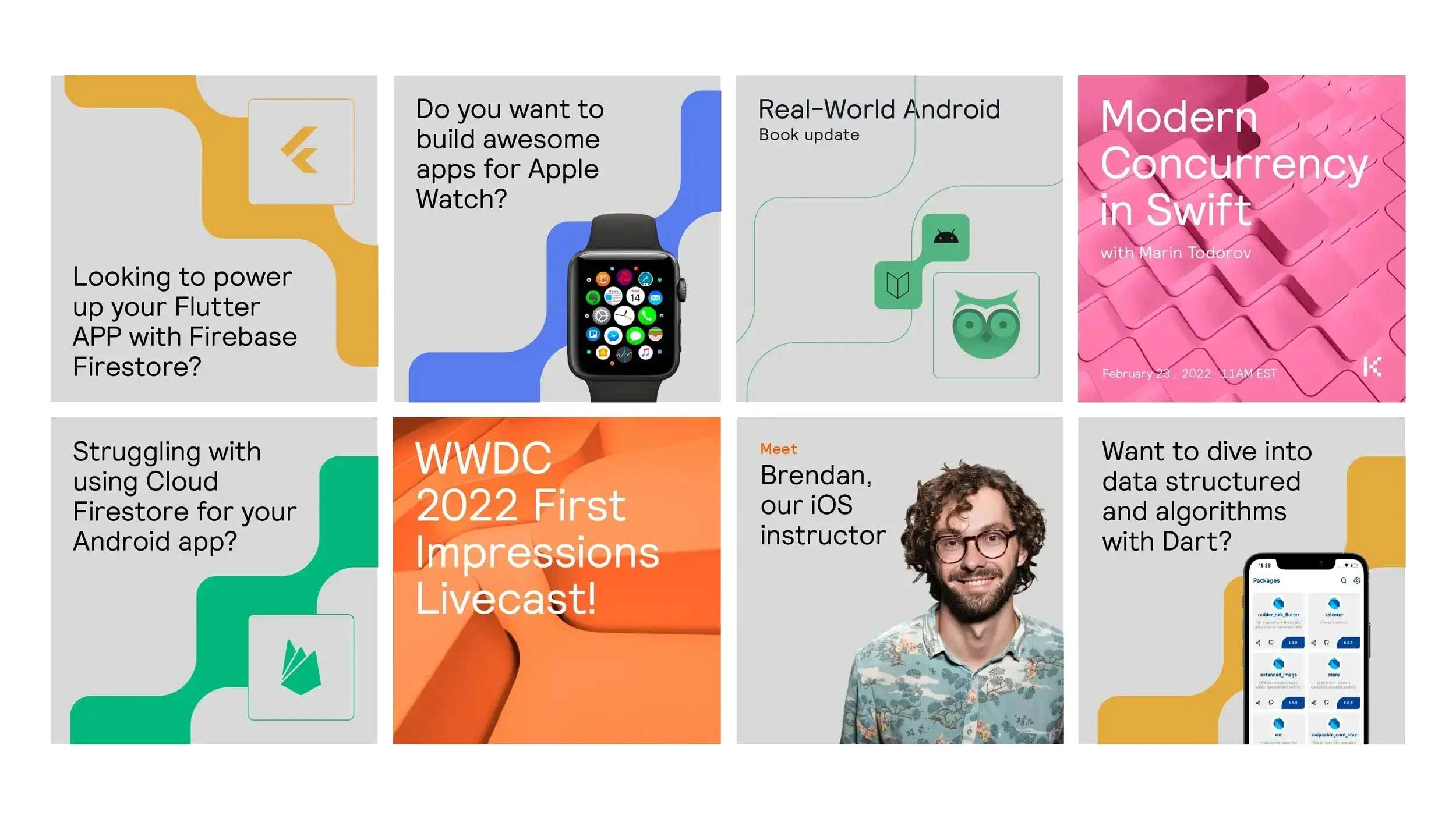
Kodeco is the new raywenderlich.com, a learning platform that supports mobile developers at every stage of their career, from creating their first app to becoming industry experts.
They already have more than 5,000 videos, created by expert developers from all over the world. As they continued to grow and to make their community more accessible, they needed to completely change the look and feel of their brand.
In order to make this right, we couldn't lose sight of its essence and the purpose for which it was created. So we had to change everything without changing the most important thing: the community.
We were looking for a name that would be easier to pronounce and remember, that would sound the same in different languages. So we decided on Kodeco, which is a neologism, a made-up word in which the concepts of Community, Code and Echo resonate.

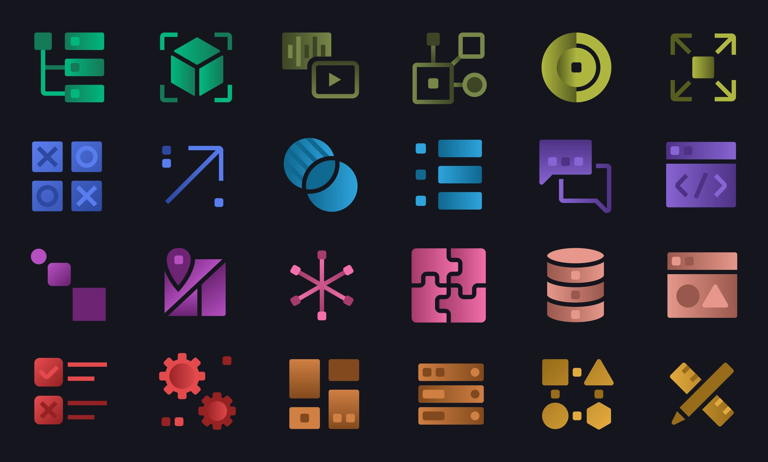
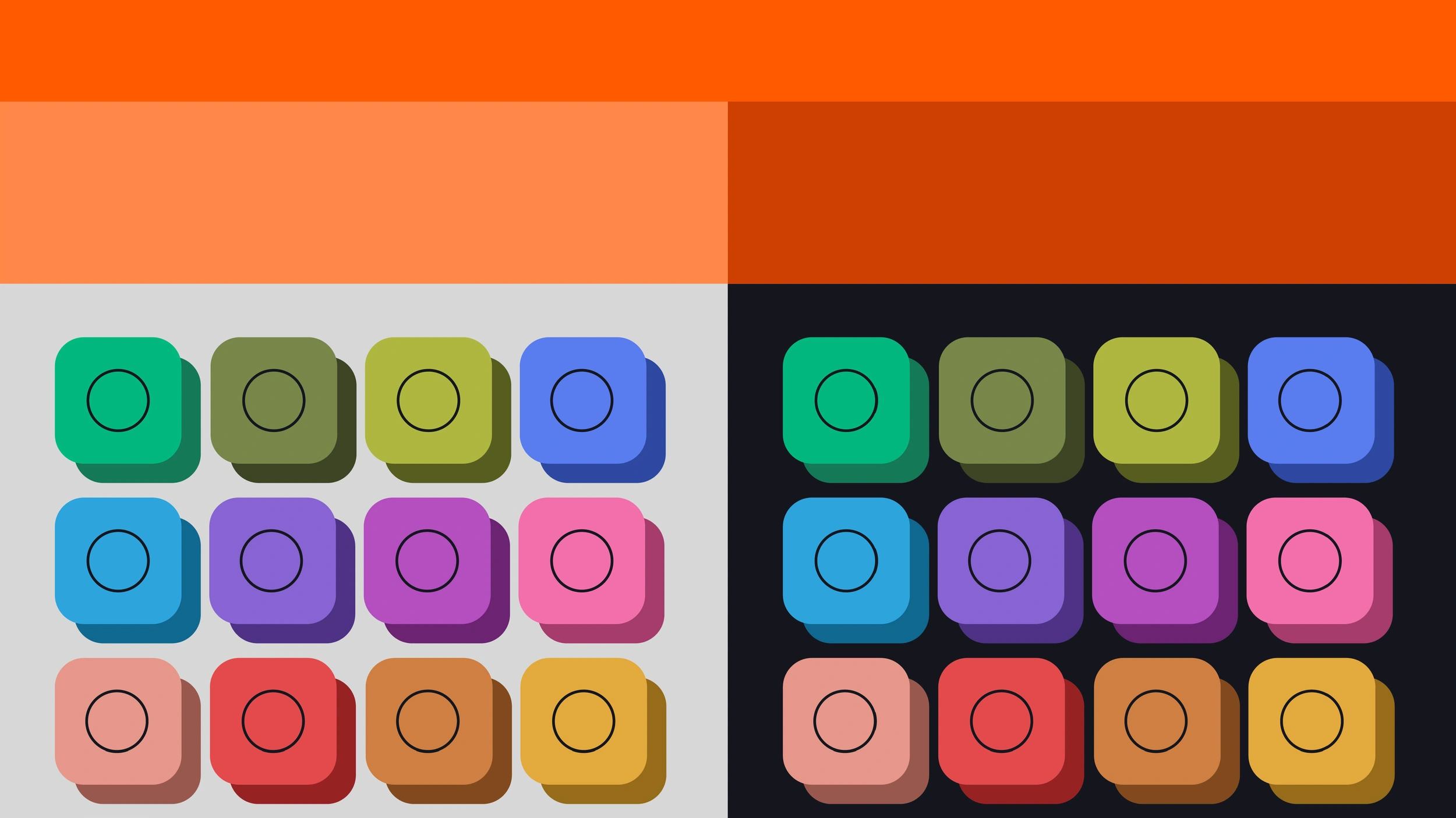
We designed a specific style of iconography to represent different types of content, but we also define a colour code for the different platforms they cover. Each icon stands for a theme and the colour defines the icon specific platform. So, we have orange as the main brand colour and 13 different colours for every specific product. Based on this system, we proposed the templates for their videos.
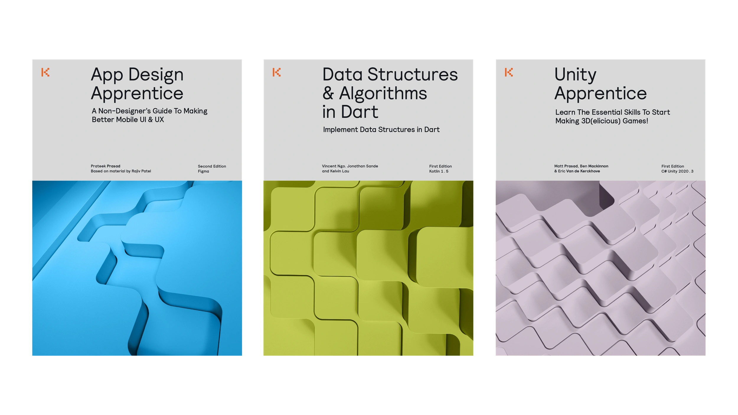
For more editorial content, such as books and website assets, we developed a series of 3D visuals. In them, large textures and close up details alternate. We create them in different colours so that they can be applied according to the platform.
Por último, aplicamos todos los aspectos de su nueva identidad visual al look and feel de los contenidos de sus redes sociales y su web.
In this way, Ray Wenderlich becomes Kodeco and kodeco.com, the place to be if you want to immerse yourself in the world of developers.
