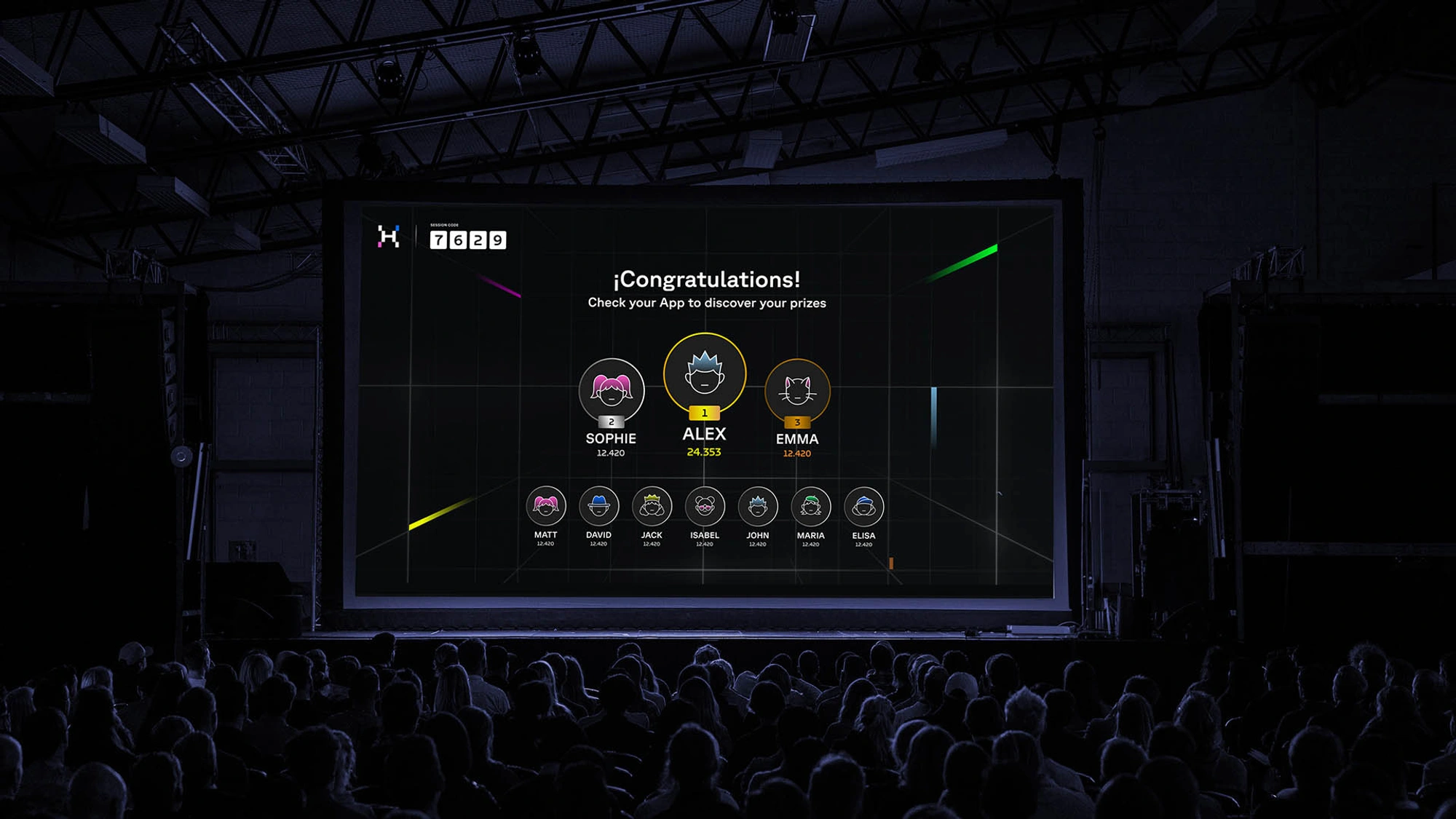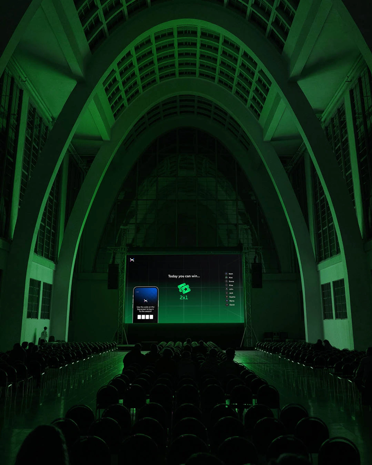

Huplei is an alternative to conventional advertising, offering an interactive experience in movie theaters before the film begins.
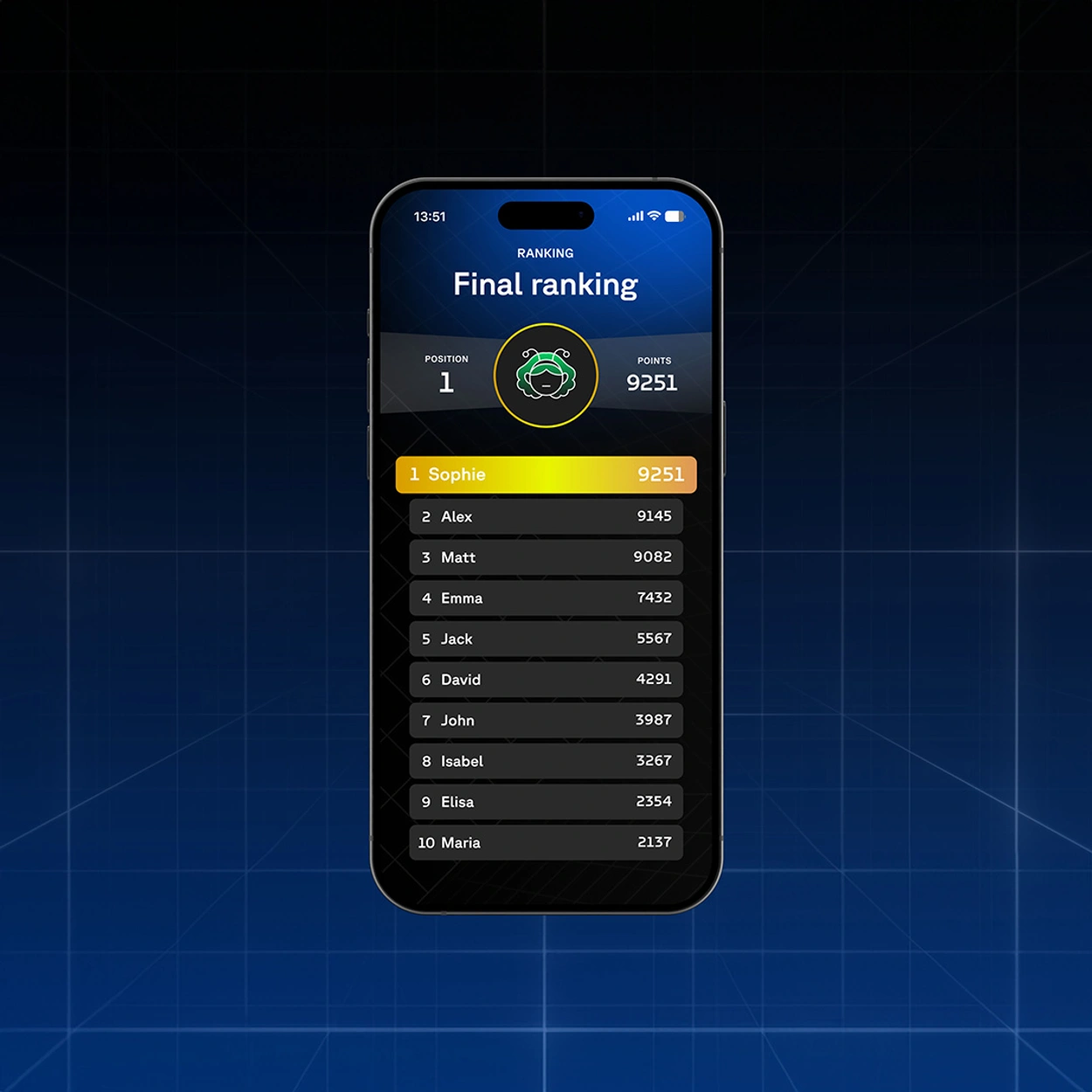
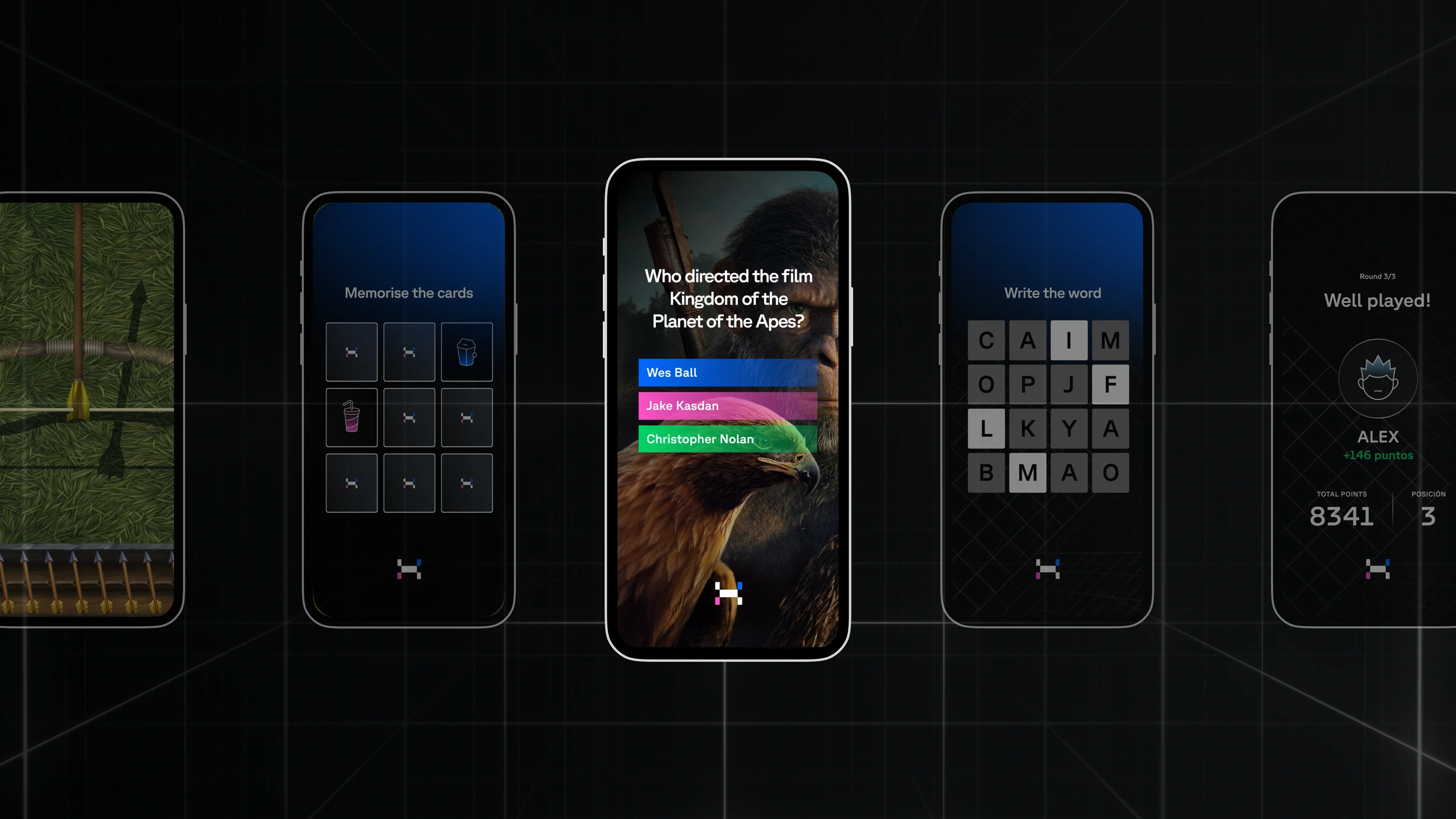
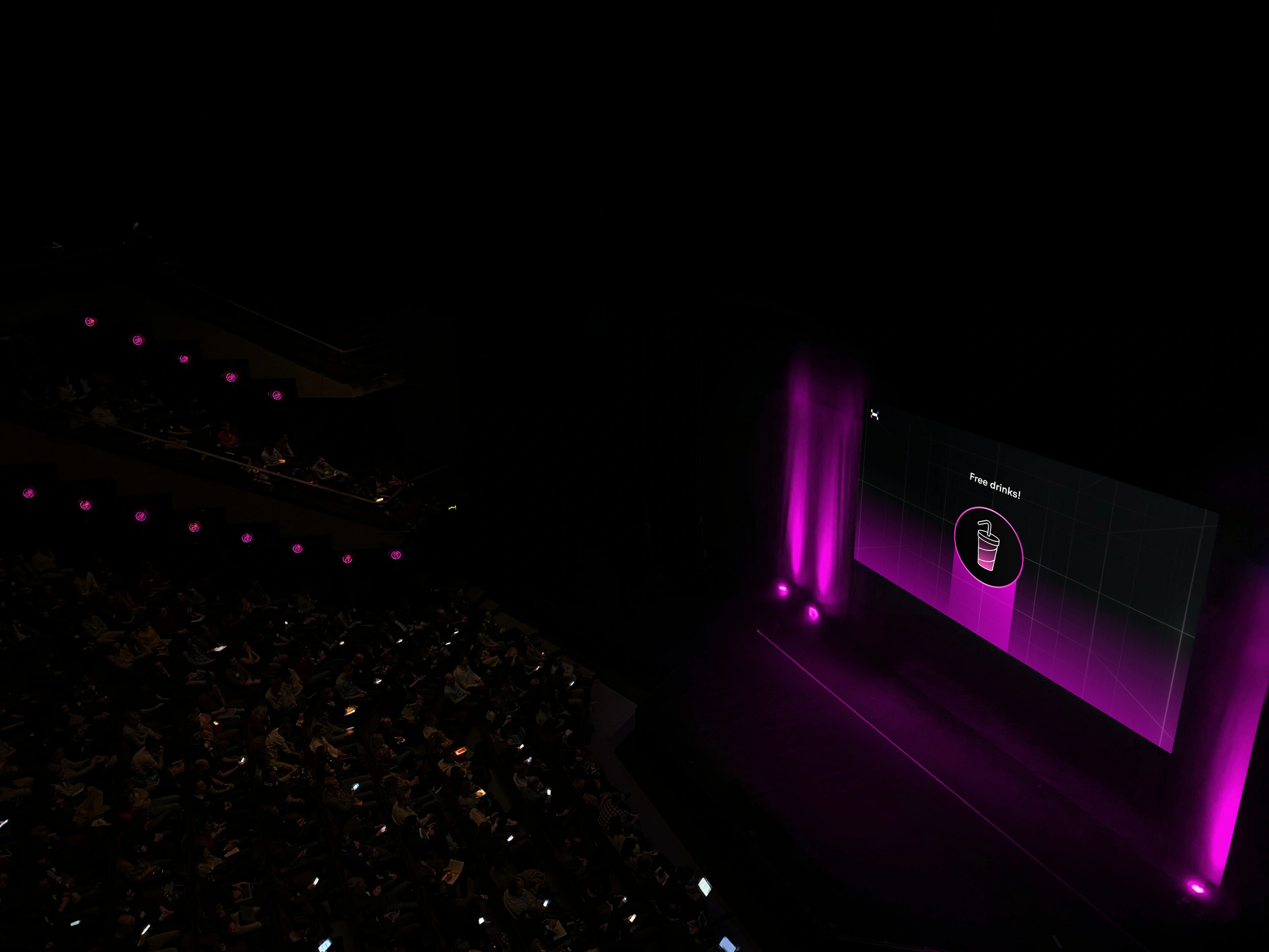
The platform offers brands an exceptional environment to make their campaigns more effective through Advergaming. How does it work? Before the movie starts, a series of brand-related games are projected on the screen, and the audience is invited to participate using their smartphones via the app. Huplei processes all player interactions and displays them on the big screen. At the end, the winners receive a prize on their smartphones.
Meanwhile, the brand can monitor the campaign in real time, allowing it to gather Big Data in a non-intrusive manner while generating greater engagement with its target audience.
Multi-screen game
The logo is inspired by the rectangular shape of the big screen itself. In fact, the isotype consists of a central screen, representing the movie theater screen, complemented by four vertical rectangles around it, symbolizing the mobile device screens through which users connect to the game.
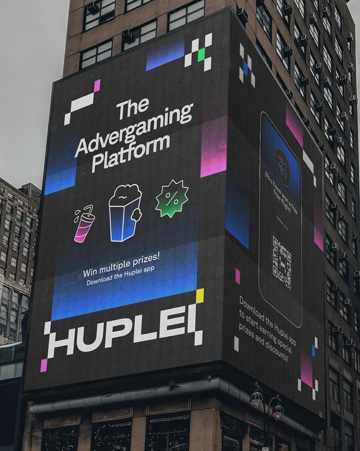
Rectangular and square shapes form the foundation of Huplei's entire identity system. Beyond the logo and isotype, these shapes are distributed throughout the brand's communication, creating a dynamic asset that minimally conveys the platform's digital and interactive essence.


The primary colors of the palette are electric blue, black, and white. The contrast between these three creates a highly technological and innovative atmosphere, following a visual code that the audience is already familiar with, thus fostering a sense of trust. To complement the palette, Huplei also incorporates light blue, yellow, orange, fuchsia, and green, which are sometimes used in flat tones and other times with a gradient effect that transitions into black.
Typography
The typography selected for Huplei's visual identity is GT Planar, a sans-serif typeface that perfectly respects and complements the rectangular and square shapes on which the brand's identity is based.
It is a highly legible typeface that enhances readability on screen, thereby improving usability and the interactive mechanics that Huplei develops throughout the user experience.
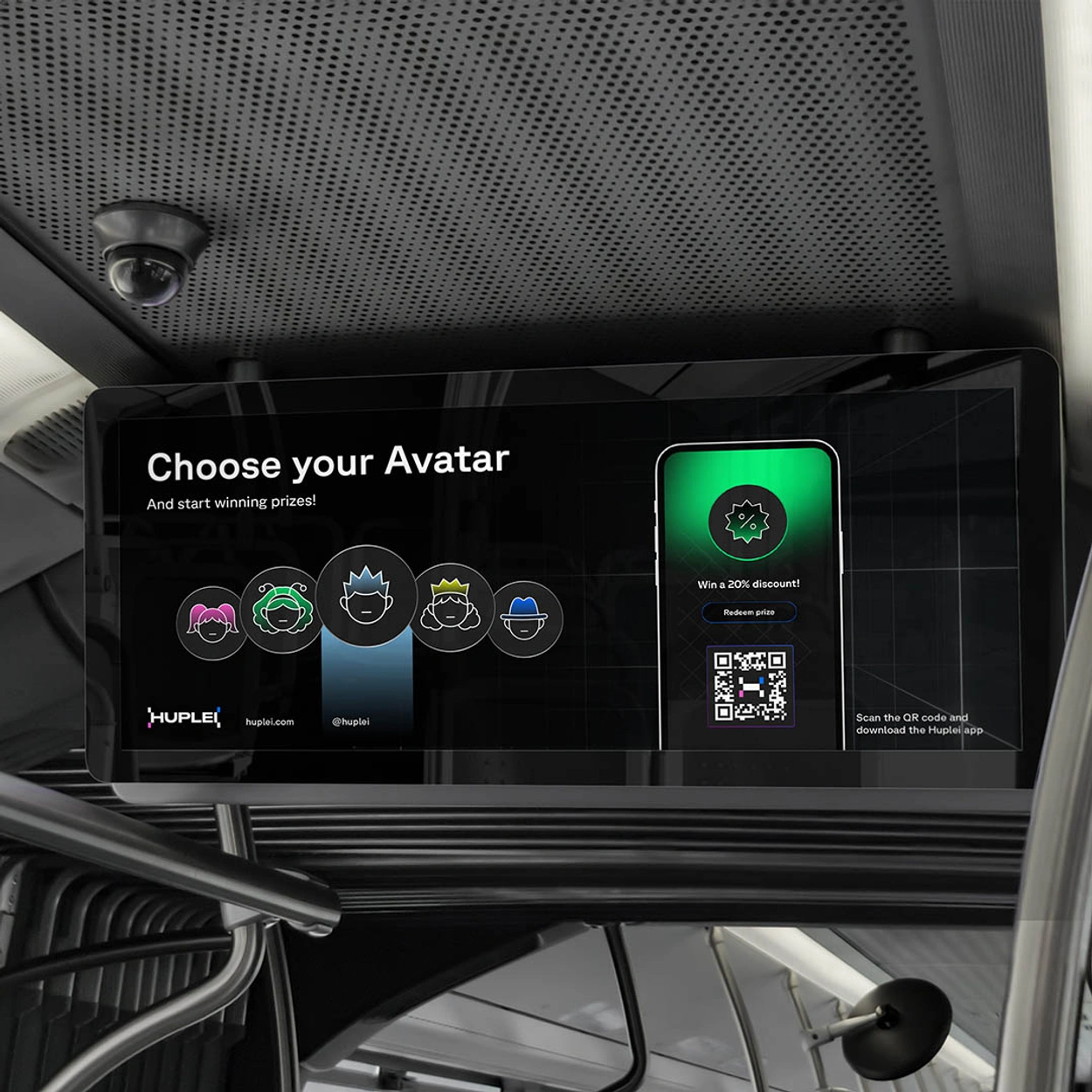
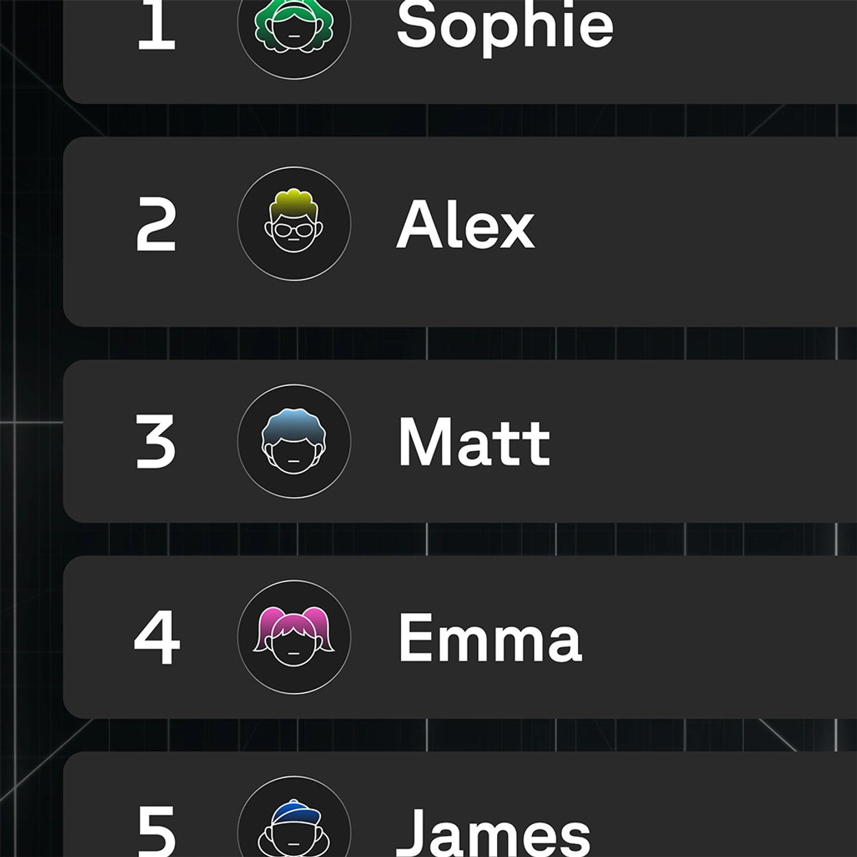
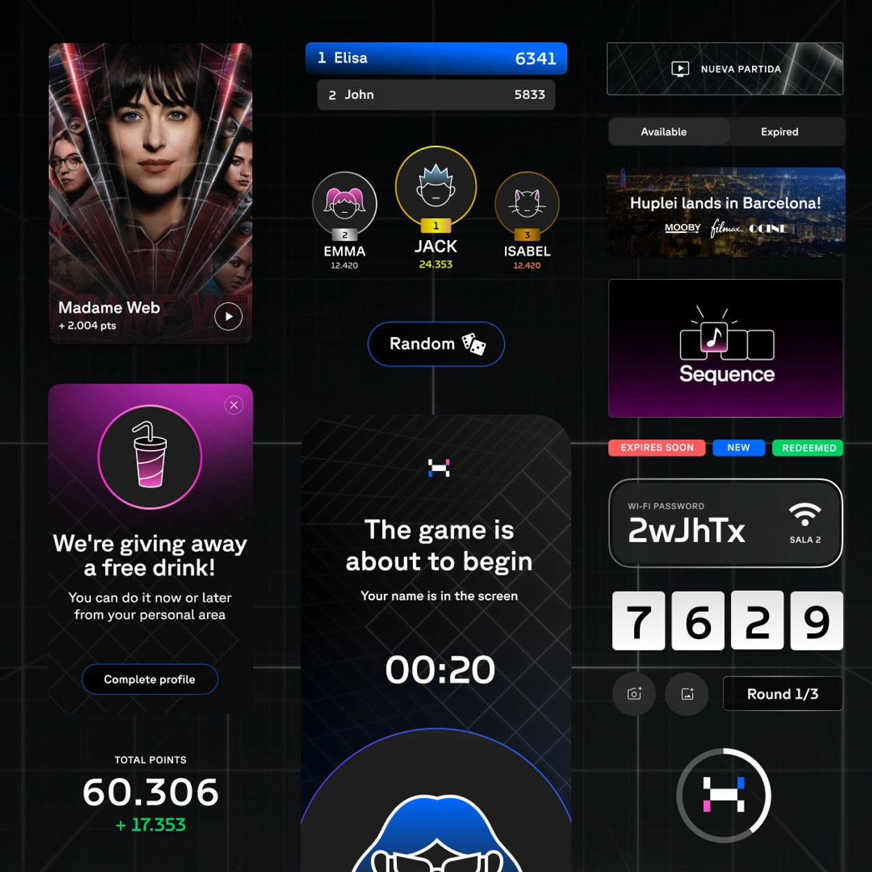
The avatars adhere to the minimalist and geometric lines of the overall system but add a touch of personalization and closeness to the end user. A series of characters have been developed, with the emphasis on the hairstyle and hair itself, which is the only part of the avatar that features color.
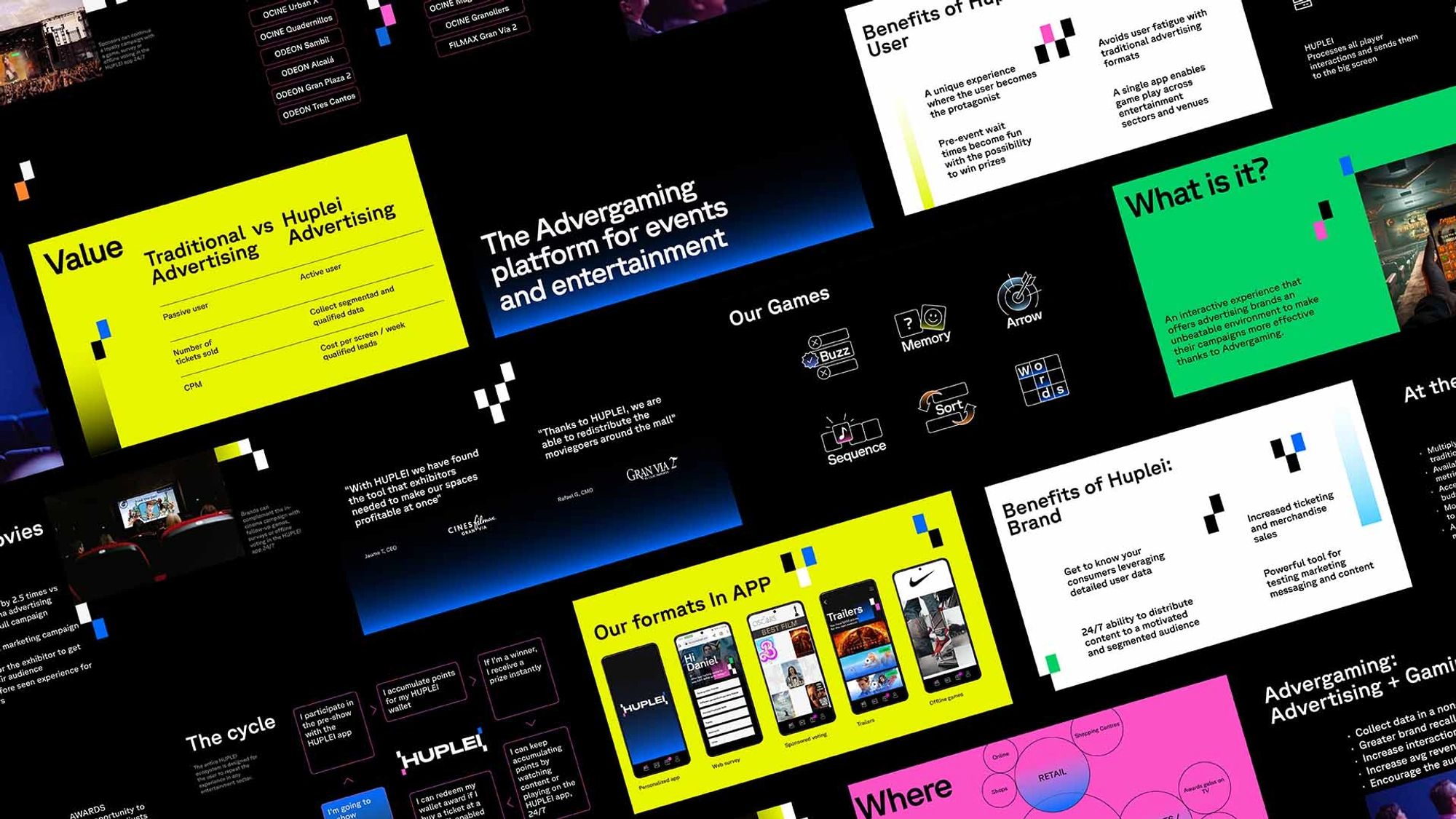
The information presented by Huplei across its various touchpoints consistently follows a highly structured and clean design. The elements that add dynamism to the visual narrative are the gradients and colored rectangles.
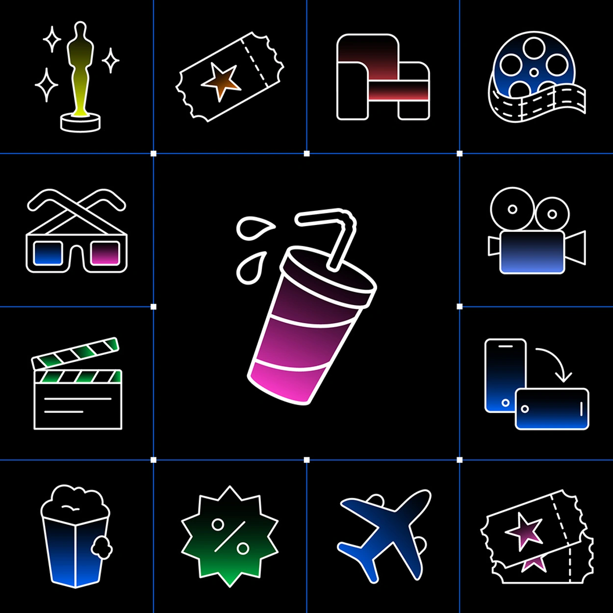
In line with the design approach for the avatars, the icons created for Huplei are simple, outlined in white, and utilize color gradients to give them a distinct personality closely connected to the brand's digital and interactive essence.
In addition to the rectangles derived from Huplei's logo and isotype, the system also incorporates a grid that creates a sense of depth. This grid establishes an imaginary space where the experience is shared, drawing a reference to the world of video games. Additionally, the grid features small animated color pills that move through the space, forming lines and appearing and disappearing in a very organic manner.
App
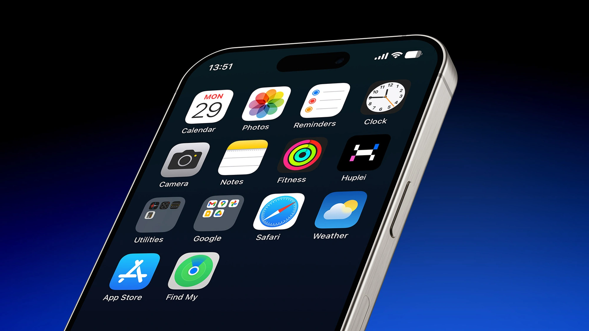
The Huplei app, also designed by Vasava, aims to create a highly intuitive and immersive user experience, allowing viewers to seamlessly assume the role of players without a second thought.
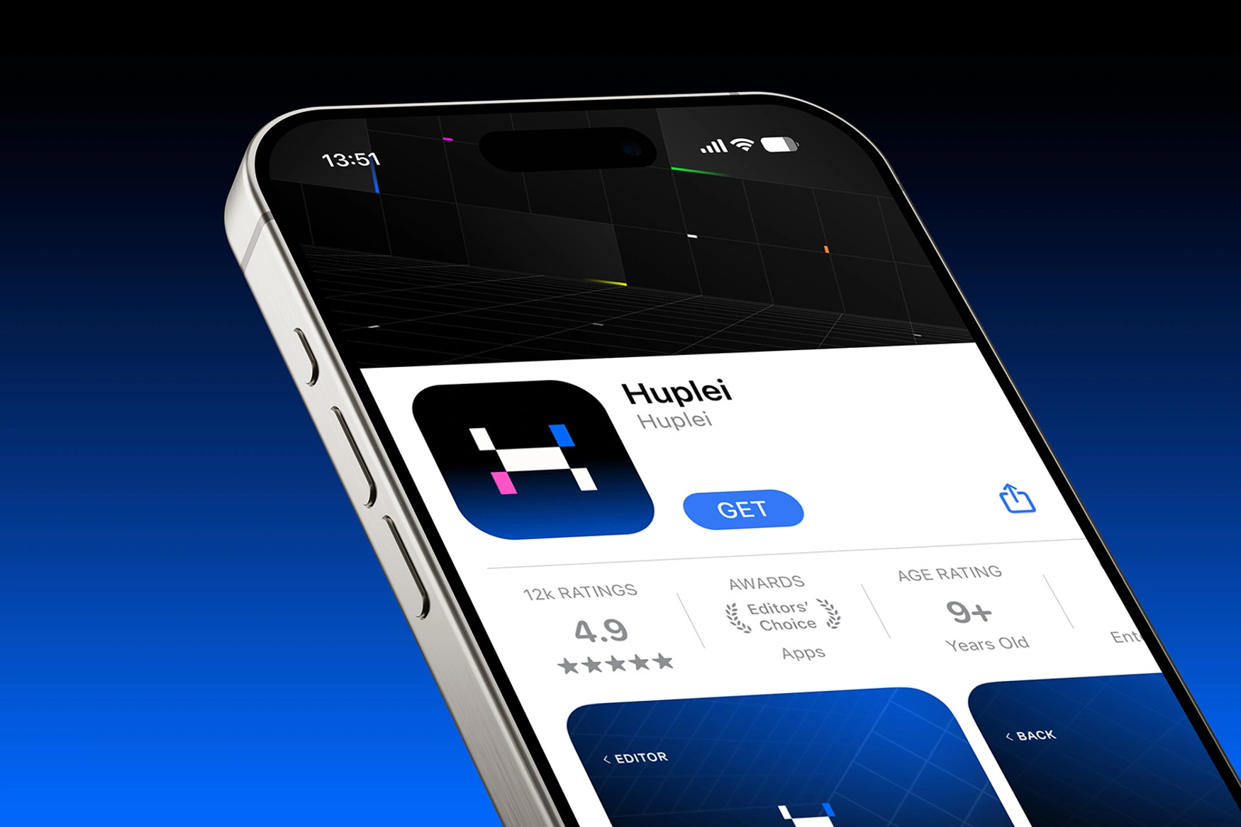
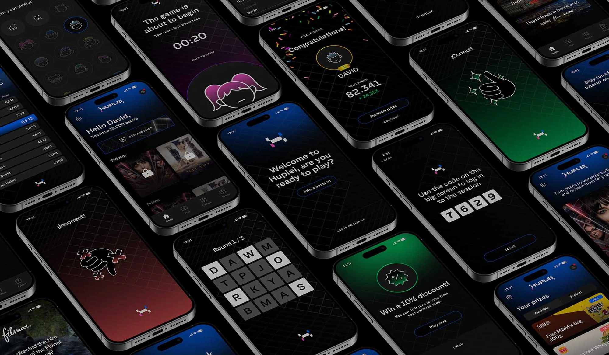
An interactive experience as compelling as Huplei's required a visual identity that matched its ambition—one that attracts the audience and fosters an immediate connection, ensuring that the only option for cinema-goers is to actively engage in the experience.
